UX and Product Design ProjectsGamified Sleep Tracking
EZZZ SLeep
Driven by curiosity and built on purpose, this is where bold thinking meets thoughtful execution. Let’s create something meaningful together.

Project Overview
-
Ezzz sleep is a sleep‑tracking app designed to make better rest feel effortless. The name reflects the core intention of the product — helping users fall asleep, stay asleep, and wake up feeling refreshed without adding more work to their already busy routines.
-
The goal of ezzz sleep is to create an automated, accessible sleep‑tracking experience that supports users in building healthier sleep habits. By reducing manual input and simplifying complex data, the app aims to make sleep improvement feel intuitive and achievable for anyone.
-
The big idea behind ezzz sleep is to combine smart alarms, personalized insights, and gentle gamification into a single, user‑friendly system. Instead of overwhelming users with charts and numbers, the app delivers clear guidance, adaptive reminders, and motivational feedback that help users stay consistent and understand their sleep patterns over time.
-
Ezzz sleep stands out by keeping sleep tracking effortless, automated, and easy to understand — no clutter, no complex charts, just clear insights that help users build better habits.
Research
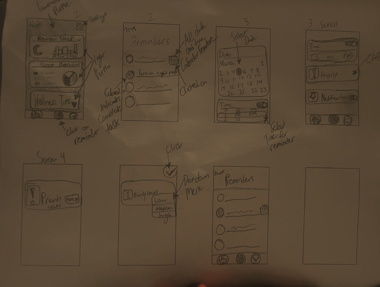
I conducted 1:1 user interviews to understand how people manage their sleep, what frustrates them about existing apps, and what tools they actually need. The interviews were structured around categories such as sleep habits, pain points, motivations, desired features, accessibility needs, and daily lifestyle context. This approach helped reveal both functional and emotional factors that influence how users interact with sleep‑tracking tools.
The interview questions were grouped into key themes to uncover patterns across participants. These included their current sleep routines, challenges with tracking or understanding sleep data, goals for improving rest, and expectations for a low‑effort, supportive app. I also explored how users prefer to receive information, what overwhelms them, and how their daily schedules impact their ability to maintain consistent sleep habits.
Across all interviews, users shared a common desire for simplicity, automation, and clarity. Many forget to log sleep manually, feel overwhelmed by complex charts, and want insights that adapt to their real routines. Participants also emphasized the need for smart alarms, personalized reminders, and accessibility features that reduce cognitive load. These findings directly shaped the direction of ezzz sleep, ensuring the design supports users without adding more work to their day.

PErsona Creation
— Alex Carter is an 18–25‑year‑old college student balancing classes, work, and a busy social life, often at the expense of consistent sleep. They struggle with irregular routines, forgetfulness, and feeling overwhelmed by complex or technical sleep‑tracking tools. Although Alex wants to feel more energized and understand their sleep patterns, they need an app that is simple, accessible, and low‑effort — something that fits naturally into their unpredictable schedule. This persona highlights the need for automation, clarity, and gentle guidance throughout the ezzz sleep experience.
Design Tenets
These design tenets helped guide my direction when making the Ezzz Sleep app. This kept the app simple, accessible, all while supporting users.
01
Ease of Use
02
Personalization
03
Inclusivity
04
Encouragement
05
Science-Based Insights
First Hi-FI Workflows + Design Tenets

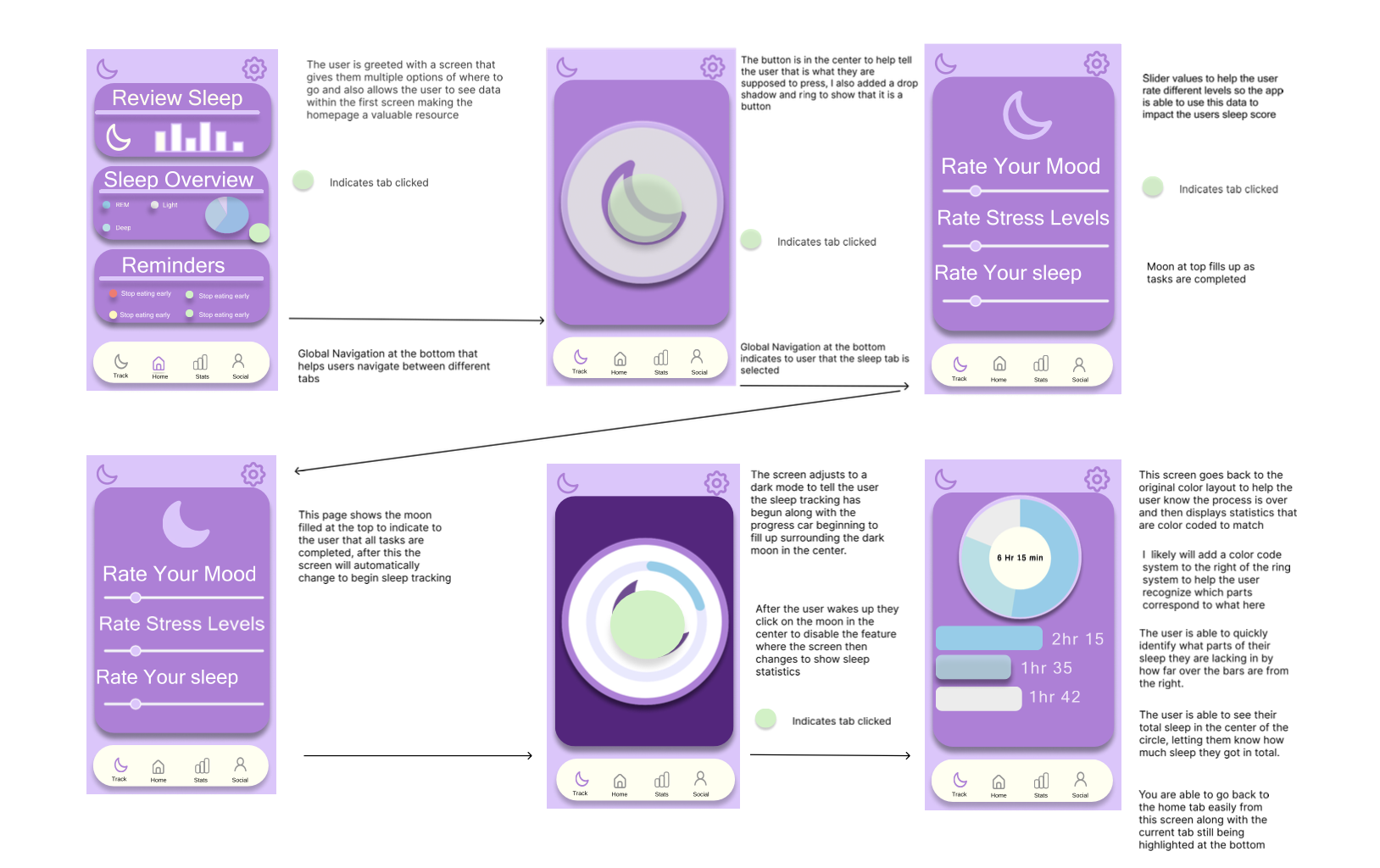
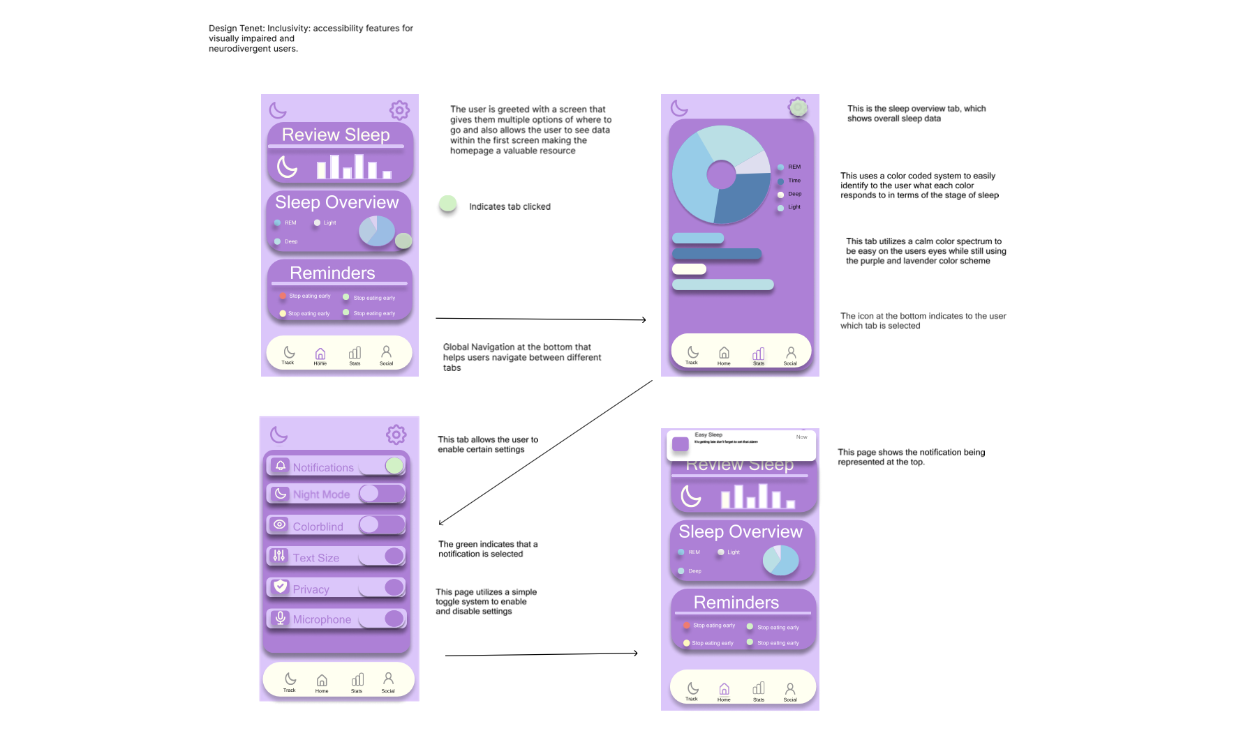
Inclusivity
This design prioritizes accessibility through clear navigation, calm color palettes, and customizable settings. Every screen is built to support users with visual impairments and neurodivergent needs without adding cognitive load.
Ease of Use
This design focuses on effortless navigation, giving users a predictable flow that reduces friction at every step. By simplifying interactions and highlighting only what matters, the experience stays intuitive and easy to move through.
Encouragement/Motivation
This experience is built to inspire users to stay consistent, celebrate progress, and feel supported along their journey. Every interaction reinforces momentum, helping people stay motivated through clear goals and positive feedback loops.
Personalization
Personalization drives engagement by allowing users to control notifications, task priorities, and visual feedback. These features create a dynamic experience that evolves with the user’s habits and goals.
User Feedback Iterations
This stage involved user testing to understand what changes to implement to the current app. This completely changed the way my app functioned and brought it to a new stage.
User Feedback Iterations
Workflow #1
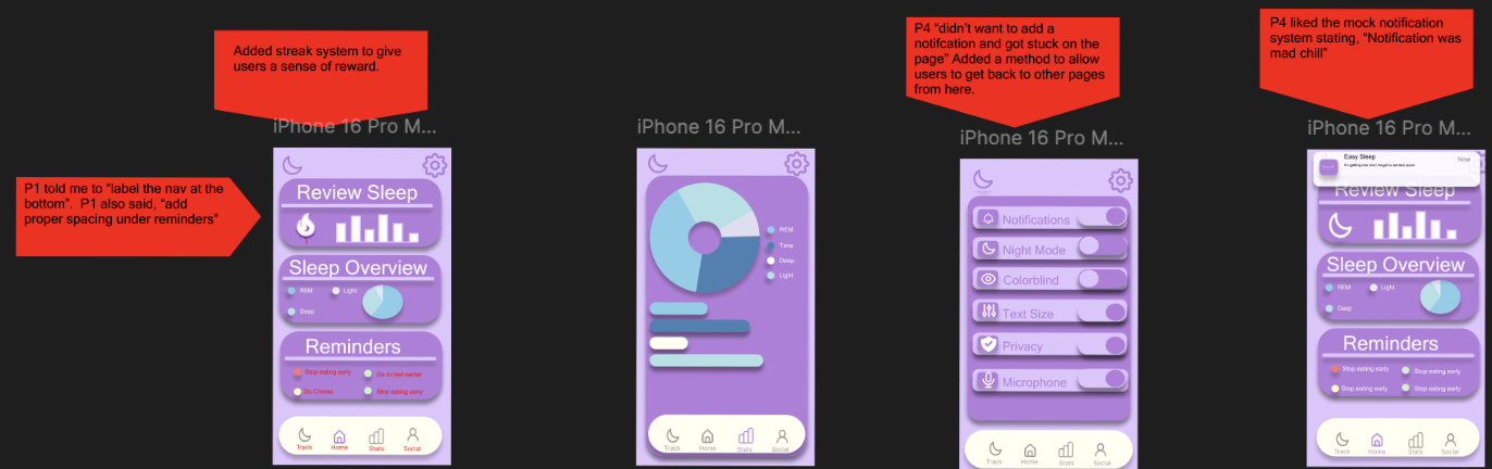
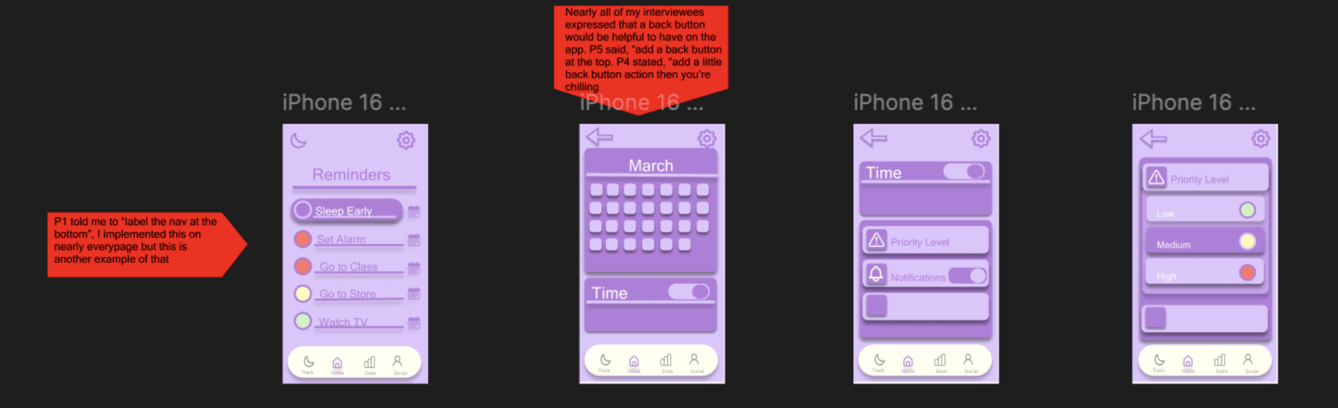
In the first iteration, user testing revealed that the bottom navigation felt unclear, especially for first‑time users. Participants mentioned that the icons alone weren’t enough, prompting the addition of clear text labels to improve wayfinding. Feedback also highlighted spacing issues under the “Reminders” section, which made the layout feel cramped. Adjusting the spacing and adding a streak system helped create a cleaner visual hierarchy while introducing a motivational element that users responded positively to.
Workflow #2
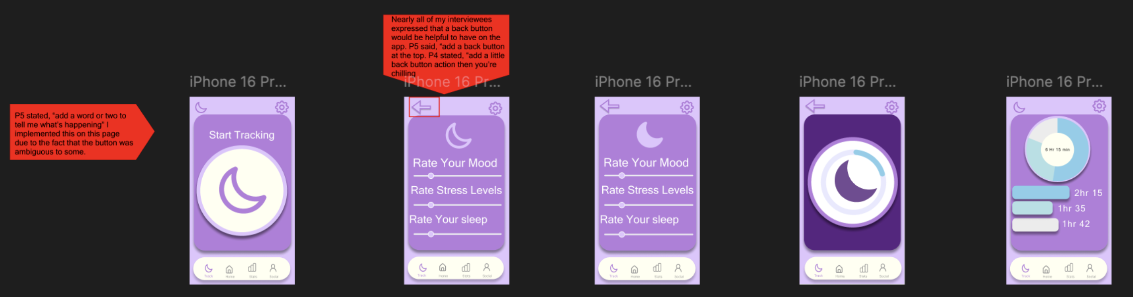
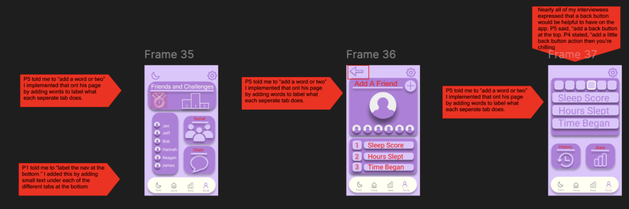
During testing, nearly every participant mentioned the need for a back button, especially when moving between rating screens. Users felt stuck without a clear way to return to the previous step, which created unnecessary friction. This iteration focused on adding a visible, consistent back button at the top of the screen, giving users more control and reducing navigation anxiety throughout the flow.
Workflow #3
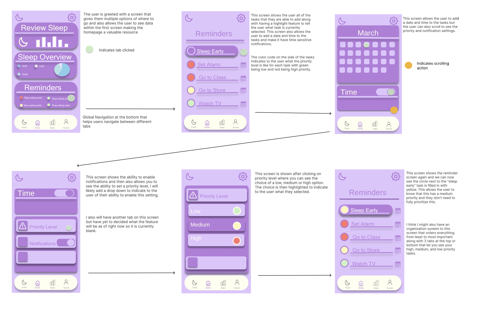
Once the back button was added, I refined the reminder setup screens to ensure the navigation felt smooth and cohesive. Users needed a clear path through selecting dates, times, and notification preferences without feeling overwhelmed. This iteration focused on organizing the content more cleanly and ensuring each step felt connected. The improved structure made the reminder‑creation process feel more guided and less cluttered.
Workflow #4
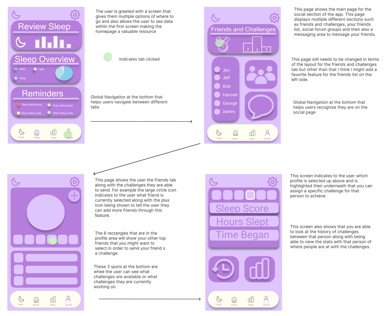
This workflow focused on refining the Social and Stats experience to make it clearer, more intuitive, and easier to navigate. Users shared that several tabs felt ambiguous, so I added short labels and descriptive text to help clarify what each section represented. Feedback also emphasized the need for a consistent back button, especially when moving between friend profiles, challenges, and detailed sleep stats. By introducing clear navigation labels and a reliable way to move backward, this iteration created a smoother, more user‑controlled flow. The result is a social experience that feels more connected, understandable, and aligned with the rest of the app’s navigation patterns.

Gamification
Bringing the app to life!
Data Visualization
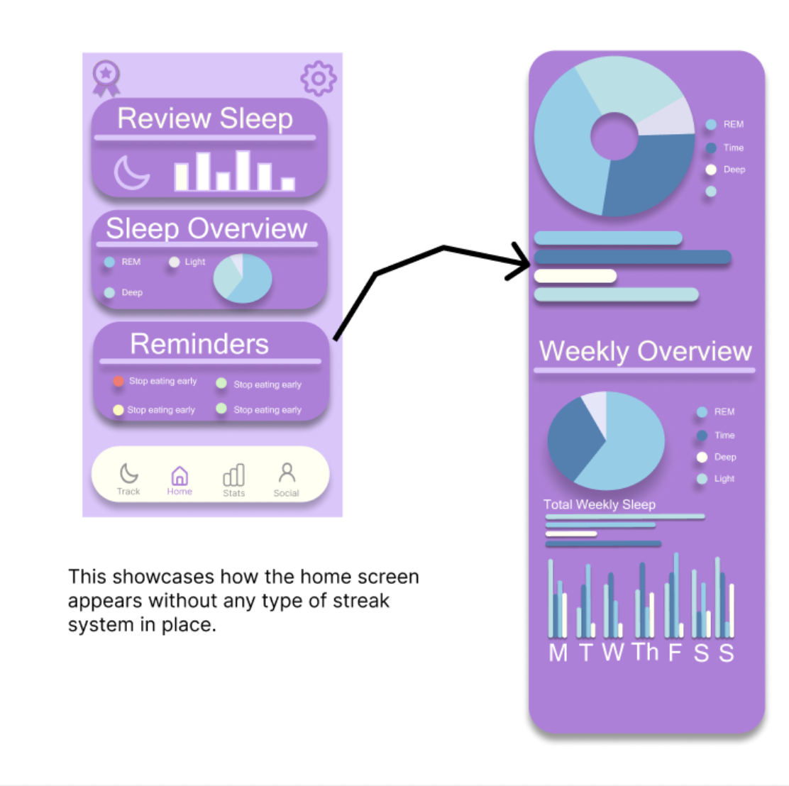
This section highlights the new data visualization feature I added to the app, showcasing how users can now scroll through multiple sets of information within a single screen. The addition of smooth scroll behavior and layered data views makes the experience feel more professional while giving users greater control and flexibility as they explore their sleep insights.
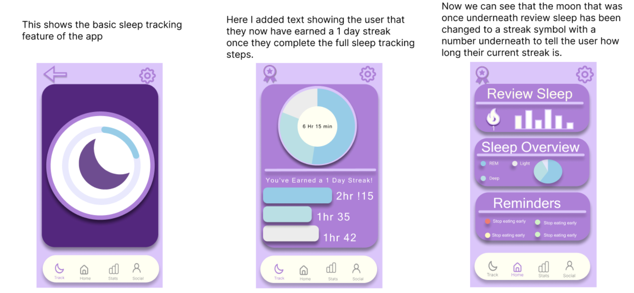
Streak System
This section highlights the updated sleep‑tracking flow, where users now receive immediate feedback and motivation through a built‑in streak system. After completing their nightly tracking steps, the app rewards them with a visible streak badge and a clear confirmation message, reinforcing consistency in a positive, low‑pressure way. The home screen dynamically updates to reflect the user’s progress, replacing the original moon icon with a streak symbol and number. These changes make the experience feel more engaging and purposeful, giving users a sense of accomplishment while encouraging long‑term habit building.
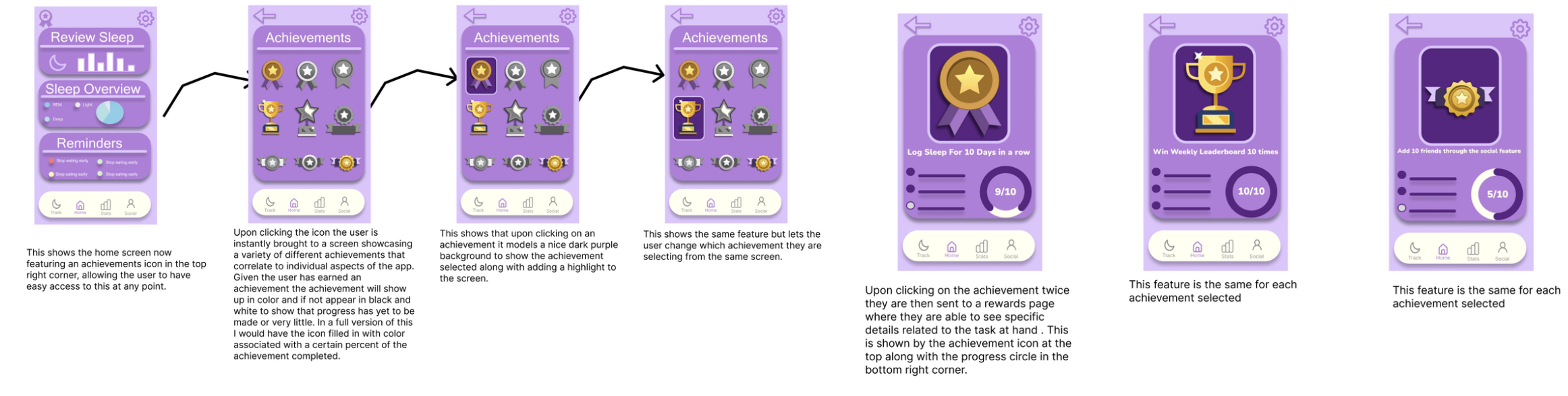
Achievements System
This section introduces the new achievements system, designed to give users a sense of progress, motivation, and long‑term engagement. From the home screen, users can now access a dedicated achievements hub that displays their milestones across different parts of the app. Achievements appear in full color once progress has been made, while incomplete ones remain muted for clarity. Selecting an achievement highlights it with a focused state, and tapping again opens a detailed view showing progress, requirements, and a visual completion indicator. This workflow creates a rewarding loop that encourages consistency, supports habit‑building, and adds a layer of personalization to the overall experience.