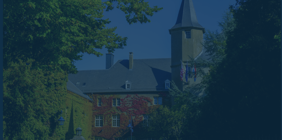
UX and Product Design ProjectsMiami University Luxembourg Foundation Site
Project Overview
-
This project is a collaborative website redesign built through an iterative, user‑centered process. Our goal was to create a modern, accessible, and visually cohesive site that clearly communicates information while supporting a smooth user experience across devices. The work spans research, planning, design, and early development, giving the project a full end‑to‑end product feel even in its current in‑progress state.
-
Our team is composed of cross‑functional members working together in defined roles, including UX designers, developers, content strategists, and accessibility leads. Throughout the project, we operated as a unified product team, sharing responsibilities, conducting critiques, and aligning on decisions to ensure the final website reflects a consistent vision. Collaboration was central, and each discipline contributed to shaping the direction of the product.
-
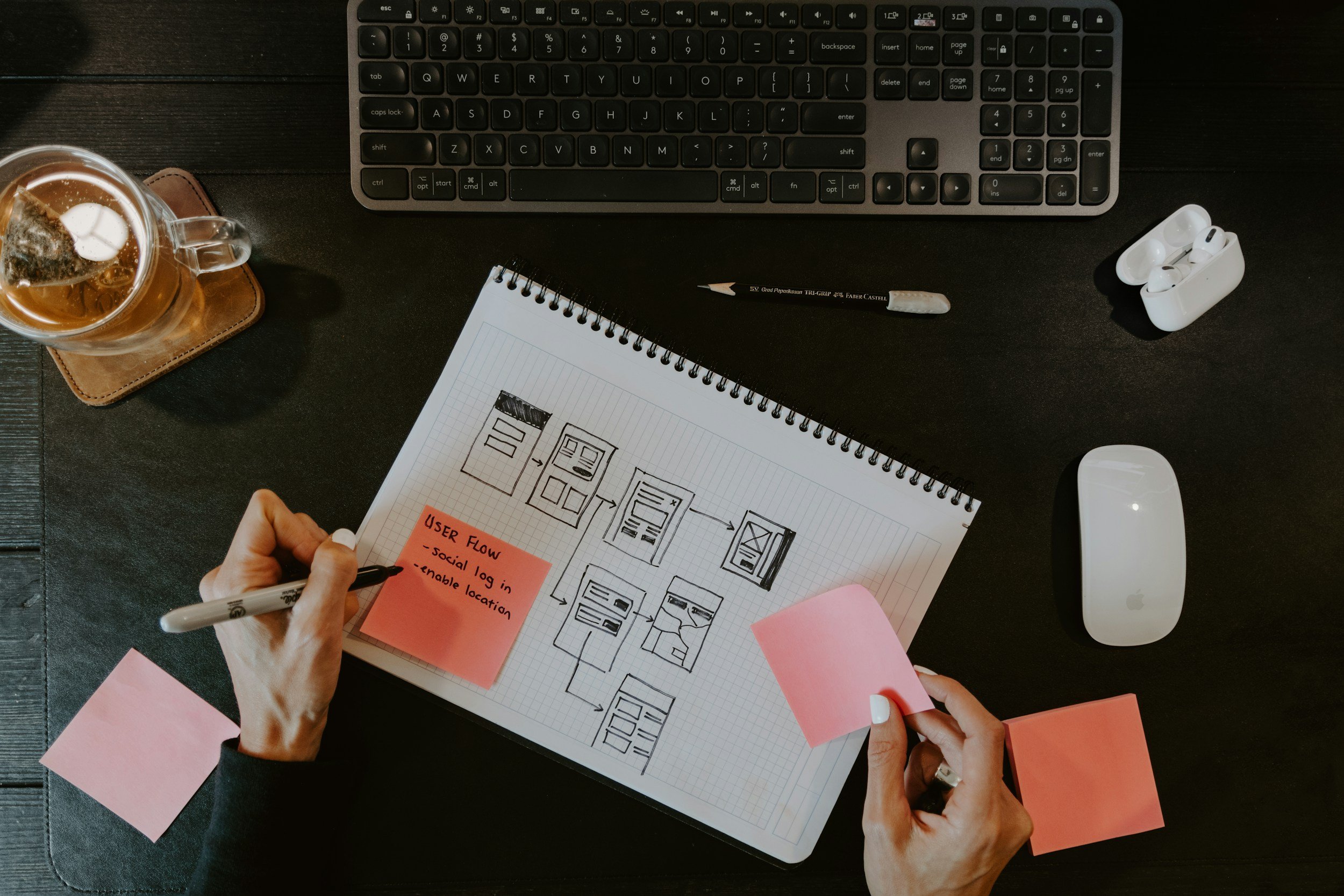
I served in multiple roles throughout the project, acting as Product Owner, Scrum Master, and UX Designer. As Product Owner, I defined priorities, clarified requirements, and ensured the team stayed aligned with project goals. As Scrum Master, I facilitated sprint planning via Trello and maintained team direction. As a UX Designer, I created wireframes, mockups, accessibility guidelines, and design system components that shaped the visual and functional direction of the website.
-
The goal of this project is to design a modern, secure, and fully accessible donation website for the Miami University Luxembourg Foundation. This site seamlessly blends Miami University’s brand identity with the visual and cultural expectations of a European audience. Because the site must support donors across Europe, a major focus of the project is ensuring compliance with GDPR and other international data‑privacy standards. Beyond legal requirements, the website aims to create a cohesive binational experience that feels trustworthy, transparent, and easy to navigate for users on both sides of the partnership. Ultimately, the goal is to build a donation platform that is visually unified, culturally considerate, and technically aligned with the expectations of European donors.

Project Charter
Problem Statement, Project Goals, Success Metrics, Constraints, Stakeholders
problem Statement
The Miami University Luxembourg Foundation (MULF) currently lacks a centralized, GDPR‑compliant digital platform for European donors, limiting both accessibility and trust. As a newly established organization with minimal online presence, MULF also struggles with low awareness in the European market. Our project aims to address these gaps by creating a secure, user‑friendly donation website that strengthens visibility and supports the foundation’s long‑term growth.
Constraints
The project operates within several important constraints that shape both the design process and the final deliverable. Because the Miami University Luxembourg Foundation serves European donors, all design decisions must align with GDPR and EU data‑privacy expectations, limiting the types of third‑party tools and integrations we can use. Our team is also focused exclusively on UI/UX design, meaning backend development, CMS setup, payment processor integration, multilingual support, and marketing execution fall outside the project scope. Additionally, the foundation’s recent establishment and limited digital presence require us to design with clarity, trust‑building, and regulatory transparency at the forefront, ensuring the website feels credible even without an existing brand ecosystem.
Success Criteria
Success for this project is defined by delivering a fully approved, on‑brand, and accessible donation website that meets the Miami University Luxembourg Foundation’s goals and European compliance requirements. The design process must stay aligned with the project timeline, incorporate client feedback at every major phase, and result in an intuitive user experience where key actions—like donating or finding information—can be completed quickly and easily. Ultimately, the final product should feel cohesive, responsive, and trustworthy across all devices, reflecting both Miami University and MULF’s shared identity.
Stakeholders / Clients
Our primary client is the Miami University Luxembourg Foundation (MULF), a newly established philanthropic organization supporting MUDEC and Miami University through European‑based giving. Key stakeholders include European alumni, local Luxembourg community members, prospective donors, and MULF/MUDEC administrators who rely on the site for communication, fundraising, and long‑term engagement. The project also involves close collaboration with internal team roles—Product Owner, Scrum Master, and UX/UI designers—who collectively ensure that the website aligns with MULF’s mission, regulatory requirements, and long‑term strategic goals.
Workflow + Team Collaboration
How our team uses Trello to dominate each sprint

Trello Board
Our team uses a structured Trello board to manage roles, track progress, and organize each sprint’s workload. The board clearly outlines responsibilities—such as Scrum Master, Product Owner, and page‑specific designers—while centralizing all key resources, including WordPress access, content drafts, and our style guide. User stories move through the pipeline from backlog to active sprint and finally to completion, giving the team full visibility into progress and dependencies. This system keeps our workflow transparent, collaborative, and aligned with agile practices, ensuring that every deliverable stays on schedule and meets the project’s standards.
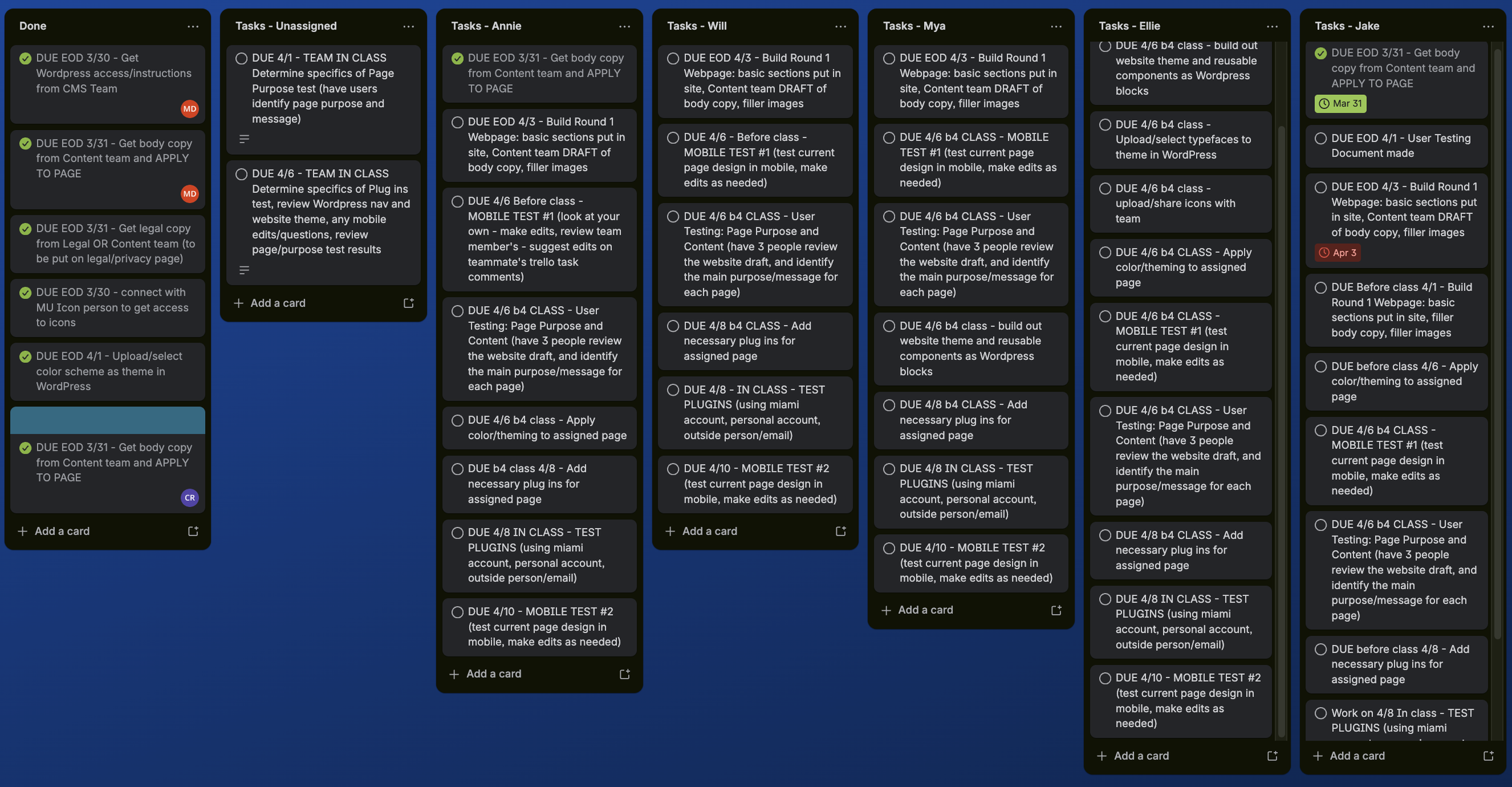
Task Management
This section of our Trello board helps us manage day‑to‑day execution by clearly organizing tasks into assigned columns for each team member, along with a dedicated “Done” column to track completed work. Every task includes a due date, description, and ownership, which keeps responsibilities transparent and ensures nothing slips through the cracks. By separating unassigned tasks, active tasks, and completed tasks, we maintain a clean backlog and a clear view of progress throughout each sprint. This structure allows the team to stay aligned, distribute workload evenly, and quickly identify what needs attention, ultimately supporting a smooth and accountable workflow from start to finish.
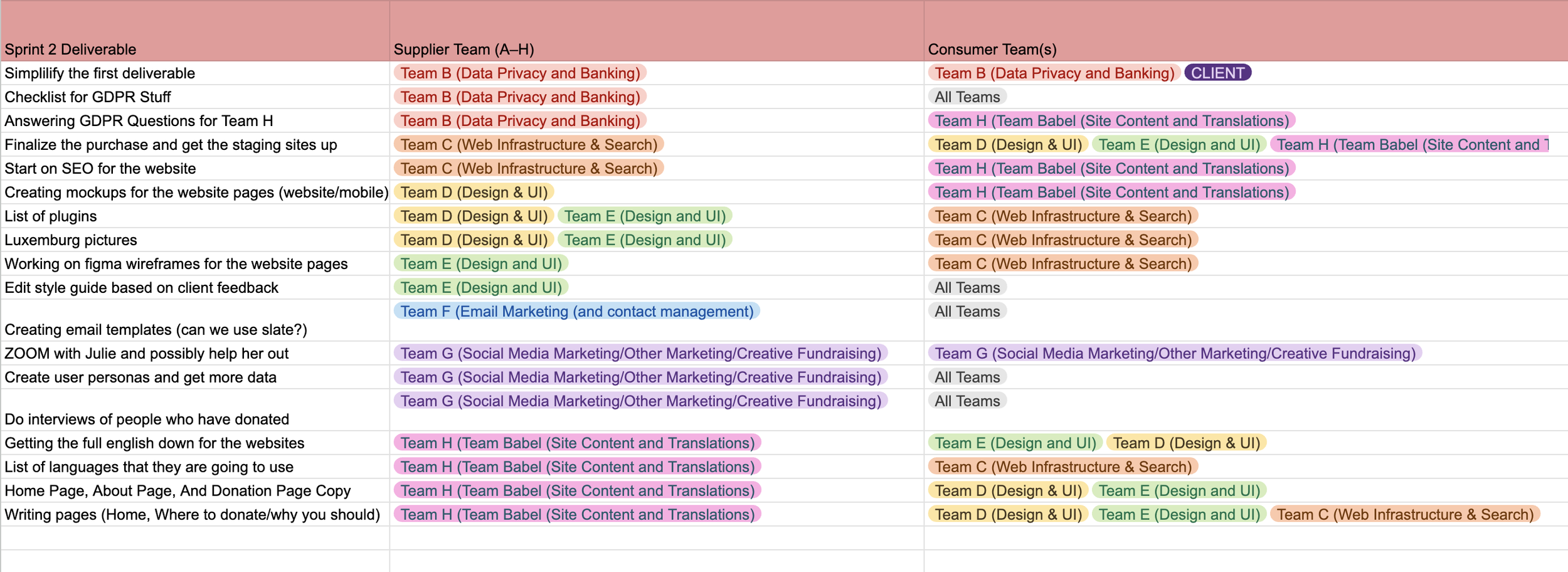
Handoff Roadmap
Our team uses this sprint‑handoff roadmap to coordinate work across multiple specialized groups, ensuring every deliverable moves smoothly between design, content, infrastructure, and compliance teams. The spreadsheet clearly outlines which team supplies each task and which teams depend on it, making responsibilities and dependencies transparent. This structure allows us to share information efficiently—whether we’re receiving GDPR guidance, passing finalized mockups to the content team, or aligning with the infrastructure team on WordPress setup. By mapping out these handoffs, we maintain momentum across sprints, reduce bottlenecks, and keep all teams aligned on shared goals and timelines.
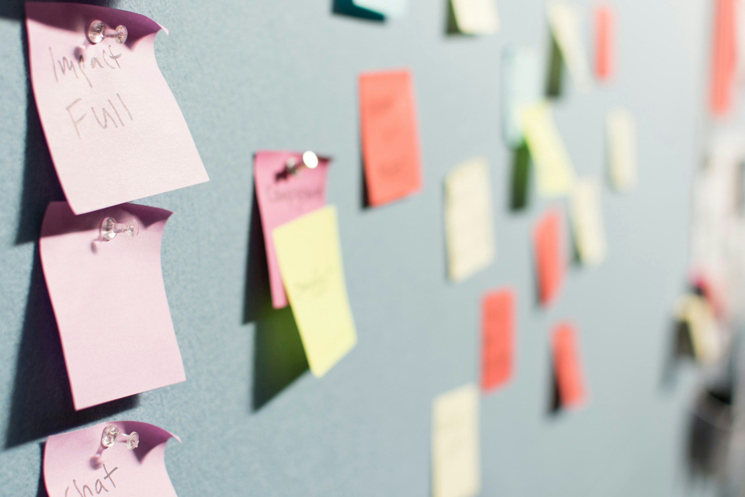
Brainstorming Doc
Across each sprint, our team uses structured user stories to guide design decisions, prioritize work, and ensure every feature directly supports the needs of donors, administrators, and first‑time visitors. Each story includes a clear Definition of Done, outlining accessibility requirements, responsive behavior, content needs, and cross‑team approvals so that every deliverable is measurable and aligned with the MULF style guide. This consistent approach allows us to break complex tasks into focused, achievable goals while maintaining transparency with other teams and ensuring that every sprint moves the website closer to a polished, trustworthy, and user‑centered final product.
TEam RetroSpective
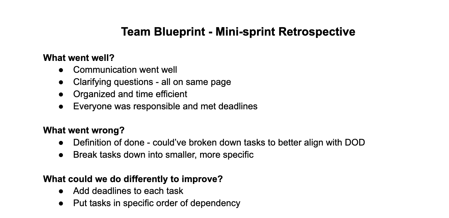
During this mini‑sprint, our team demonstrated strong communication, accountability, and alignment, which allowed us to stay organized and meet all internal deadlines. We quickly established clear channels for collaboration, kept absent members informed, and used clarifying questions to ensure everyone understood their responsibilities before working sessions began. One area for improvement was the connection between our tasks and the Definition of Done—while the work was completed successfully, we recognized the need to break tasks into smaller, more specific steps that map directly to the DOD. Moving forward, we plan to strengthen our workflow by assigning mini‑deadlines and ordering tasks by dependency, helping us work more efficiently and maintain clarity throughout future sprints.
Style Guide
A cohesive style guide to help guide all future design choices on the MULF website.
Research
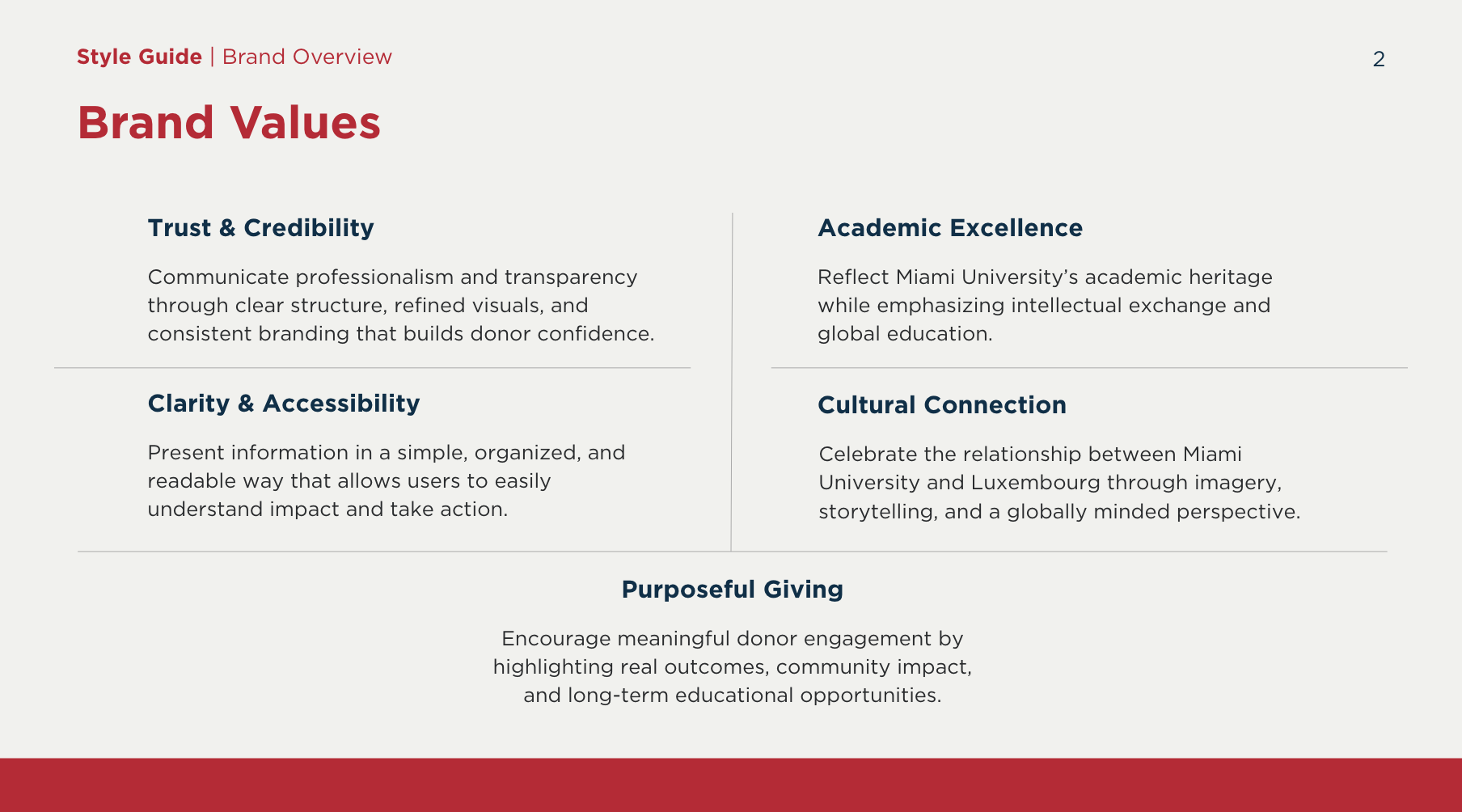
Our research focused on understanding the core identity, values, and long‑term positioning of the Miami University Luxembourg Foundation so the visual system could be built on a clear strategic foundation. By analyzing the institution’s academic heritage, European context, donor expectations, and cultural touchpoints, we identified the key themes that shape the brand: trust, academic excellence, clarity, cultural connection, and purposeful giving. These insights guided the development of our brand values and vision, ensuring that every design choice—from typography and color to layout and imagery—reflects the Foundation’s credibility, international character, and commitment to meaningful educational impact.
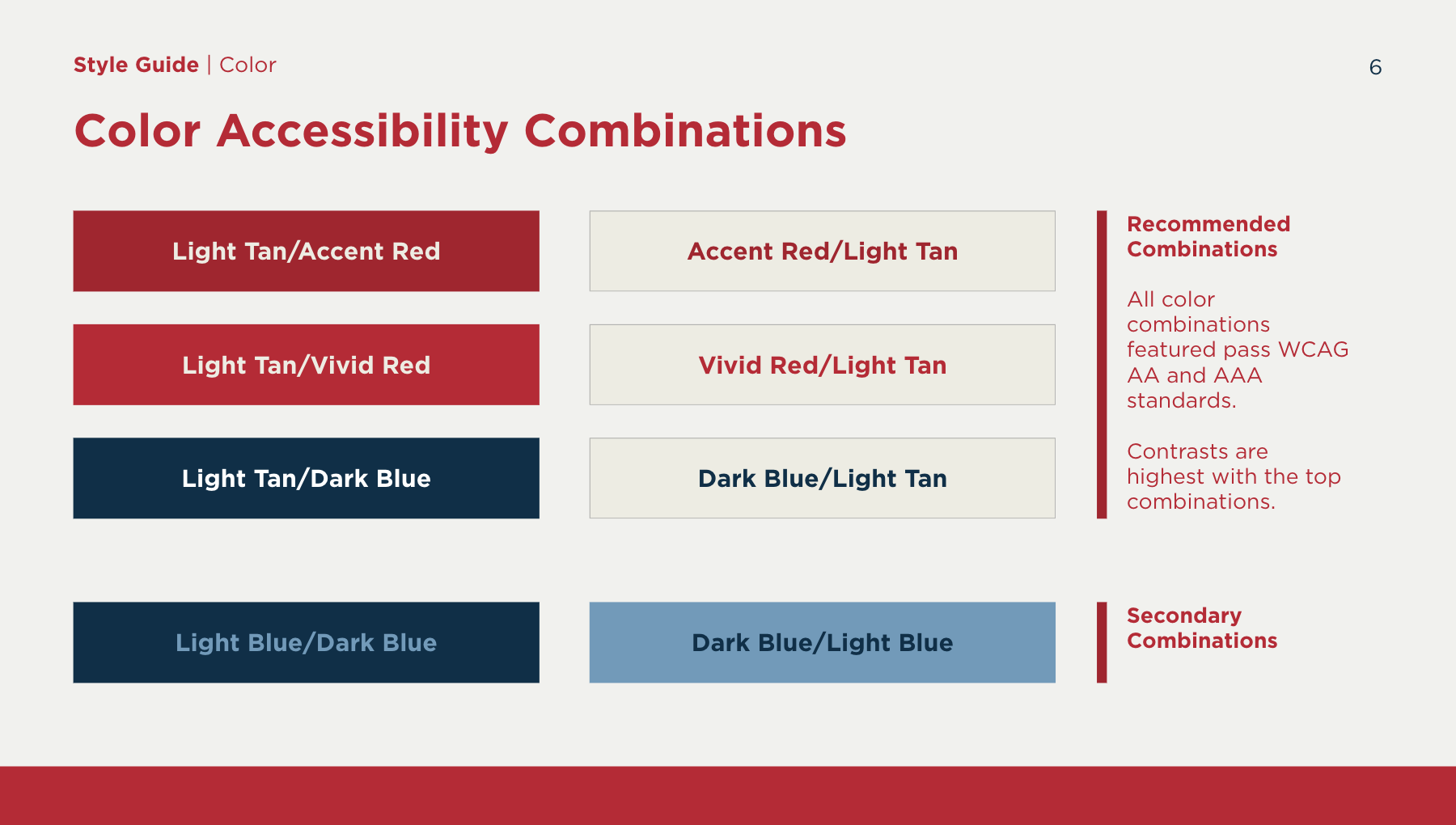
Color OVerview
The Miami University Luxembourg Foundation’s color system is designed to create a unified, recognizable, and accessible brand experience across all touchpoints. Miami Red and White serve as the dominant colors, grounding the identity in Miami University’s academic heritage and reinforcing institutional credibility. Secondary tones—such as Luxembourg Blue, Medium Tan, and Accent Red—are used more sparingly to introduce contrast, hierarchy, and a subtle European influence, while neutral shades provide structure and clarity. All approved color pairings meet WCAG AA and AAA accessibility standards, ensuring strong contrast and readability across headings, body text, buttons, and interactive elements. By maintaining intentional color proportions and prioritizing accessible combinations, the palette achieves a balanced visual rhythm that communicates trust, transparency, and a refined international character.
Typography
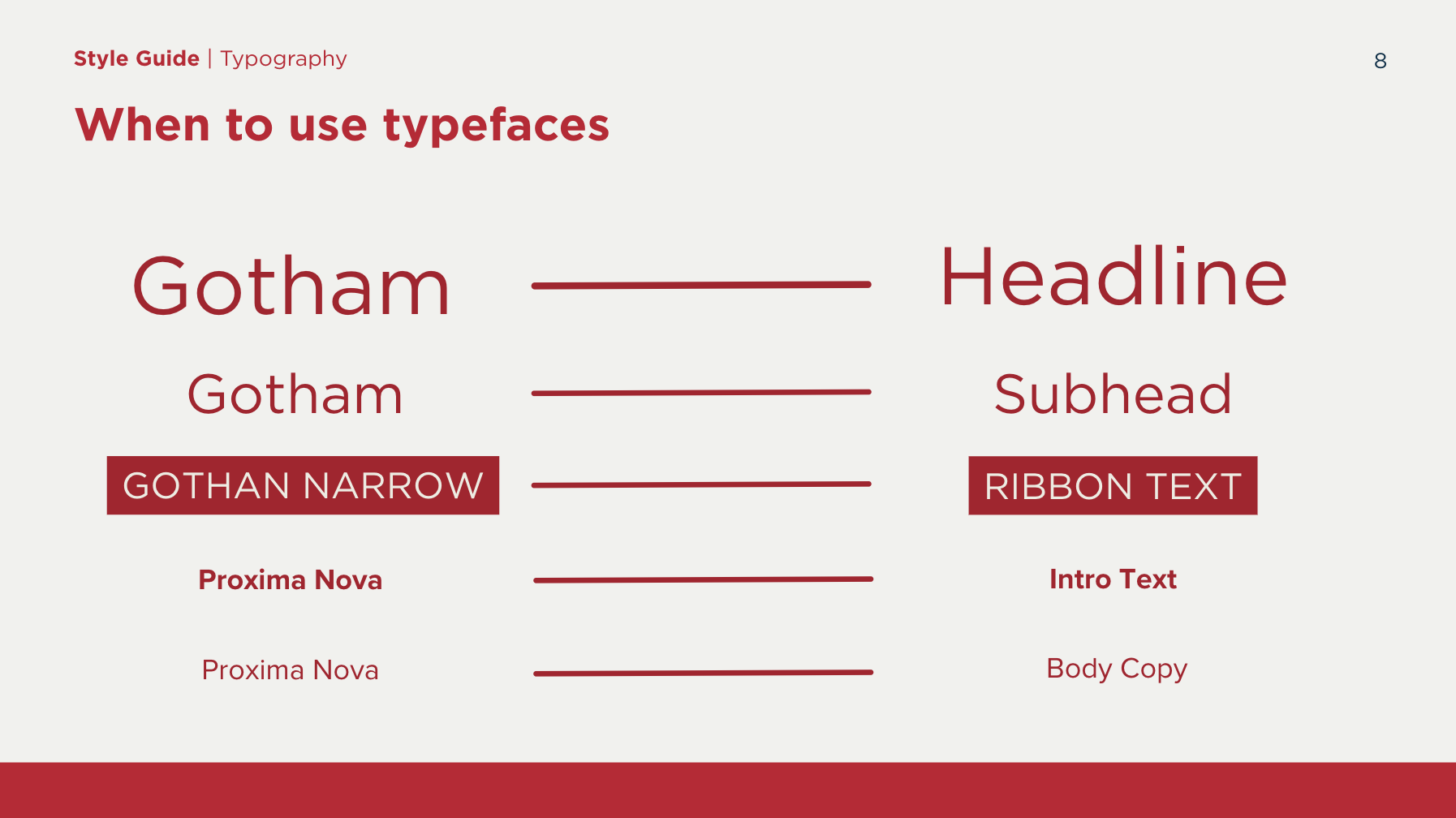
Typography plays a central role in establishing the Miami University Luxembourg Foundation’s visual voice, creating a clear hierarchy that guides users through content with ease and consistency. The type system pairs strong, structured headline fonts with clean, highly readable body styles to balance academic formality with modern accessibility. Gotham and Gotham Narrow are used for headlines, subheads, and ribbon text to convey authority and precision, while Proxima Nova supports longer passages of body copy with a warm, approachable tone. By assigning each typeface a specific purpose and maintaining consistent usage across all materials, the brand achieves a cohesive typographic rhythm that enhances clarity, reinforces credibility, and supports an intuitive reading experience across digital and print environments.
Imagery
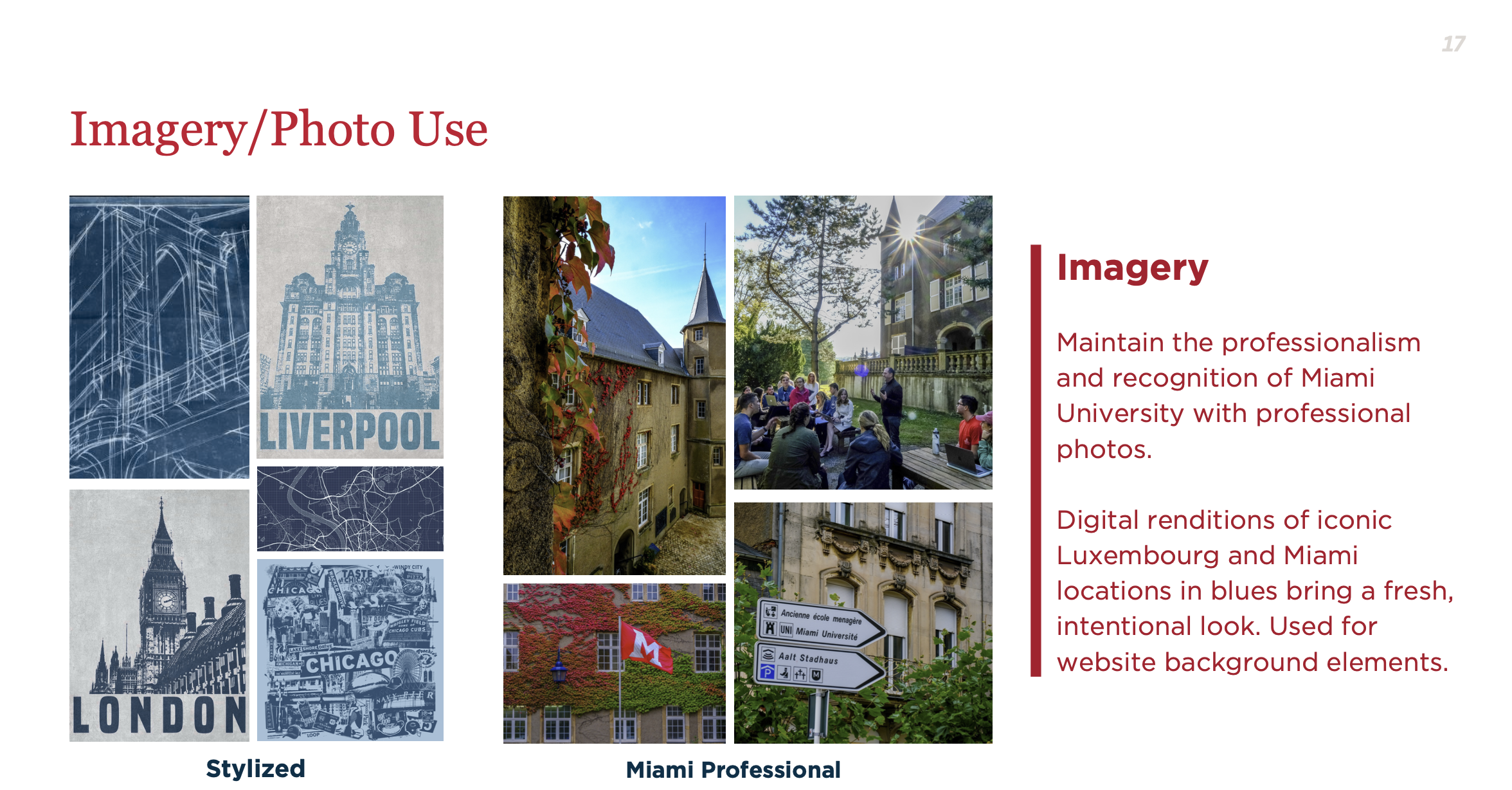
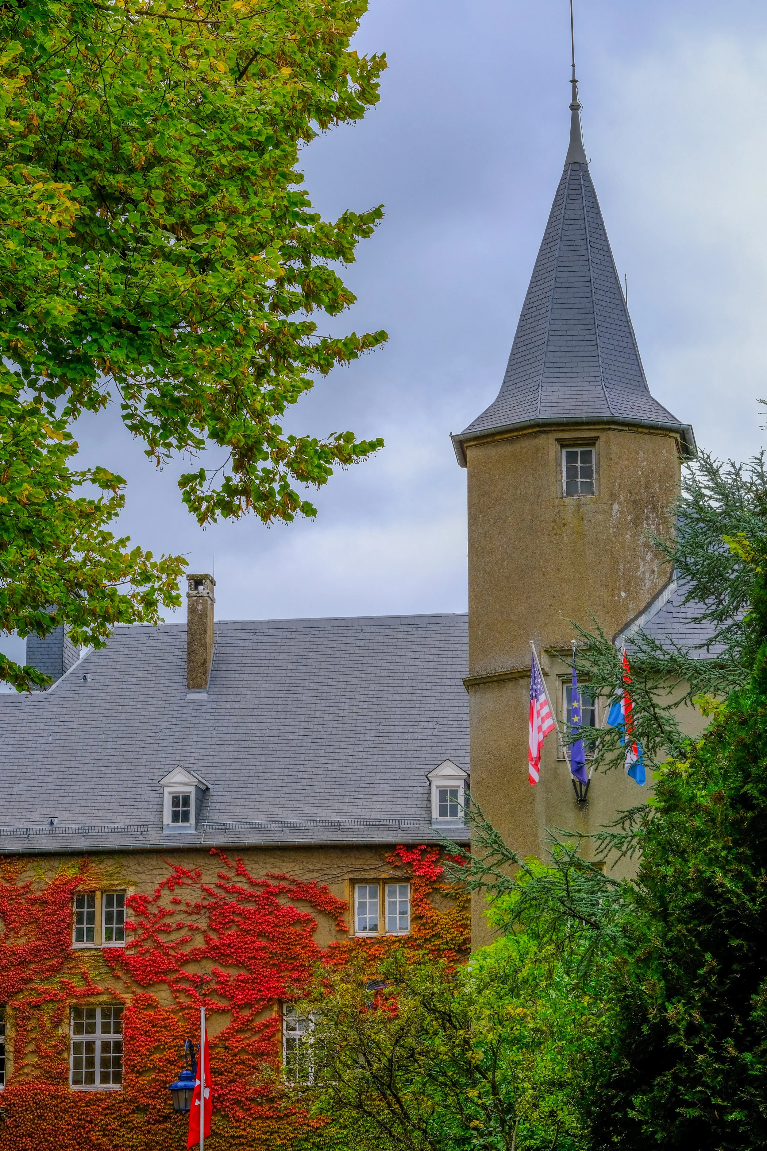
Imagery plays a key role in expressing the Miami University Luxembourg Foundation’s identity, balancing professionalism with a sense of place and cultural connection. The brand uses high‑quality, professional photography to maintain credibility and reinforce Miami University’s established visual standards. These images highlight campus life, architectural details, and the Foundation’s international environment. Complementing this, stylized blue‑toned digital renderings of iconic Miami and Luxembourg locations introduce a modern, intentional layer to the visual system. Used primarily as background or supporting elements, these graphics add depth and cohesion without distracting from core content. Together, the photography and stylized imagery create a unified visual language that feels polished, globally minded, and distinctly tied to the Foundation’s mission.
Nav Bar
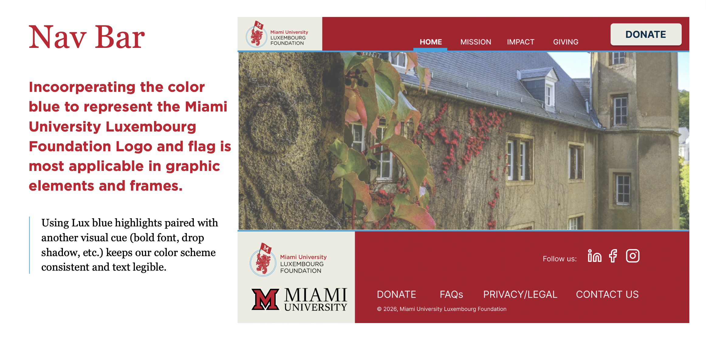
The navigation system uses Miami Red as the primary anchor, creating a strong visual connection to the university while keeping the interface clean and recognizable. Luxembourg Blue is introduced sparingly as an accent to highlight key actions like “Donate,” ensuring important elements stand out without disrupting brand consistency. Together, the nav bar and footer maintain a professional, structured look that supports usability and reinforces the Foundation’s identity across the site.
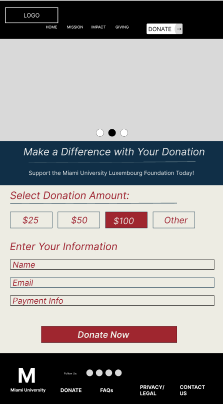
Wireframes
Donation Iteration 1
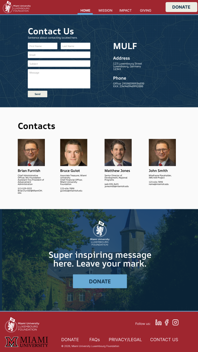
Contact Page
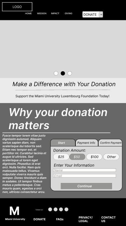
Donation Iteration 2
Donation Page
Low-Fidelity Wireframes
To explore the best structure for the donation experience, I created two low‑fidelity wireframe concepts that tested different layouts, content hierarchy, and user flows. The first version focused on a simple, single‑page form, while the second introduced a clearer step‑by‑step process and additional context about why donations matter. After sharing both iterations with my team, I gathered feedback on clarity, usability, and visual flow, which helped identify what elements felt intuitive and what needed refinement. This collaborative review guided the direction for the high‑fidelity design, ensuring the final donation page was both user‑friendly and aligned with the Foundation’s goals.
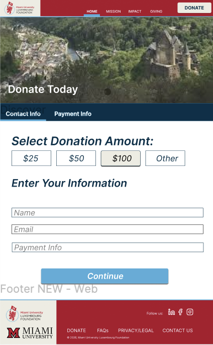
High-Fidelity Wireframes
In the high‑fidelity stage, the layouts were refined to feel cleaner, more structured, and fully aligned with the brand’s visual system. The navigation bar was simplified and polished for better readability, with consistent spacing, clearer hierarchy, and improved contrast. Button colors were updated to follow the finalized palette, ensuring that primary actions like “Donate” stand out while maintaining accessibility standards. Form fields, spacing, and section dividers were tightened to create a smoother visual flow, and imagery was integrated more intentionally to reinforce the Foundation’s identity. These refinements transformed the early concepts into a professional, user‑ready interface that reflects both usability best practices and the brand’s design principles.

Next Steps
The future of MULF website design
Wordpress
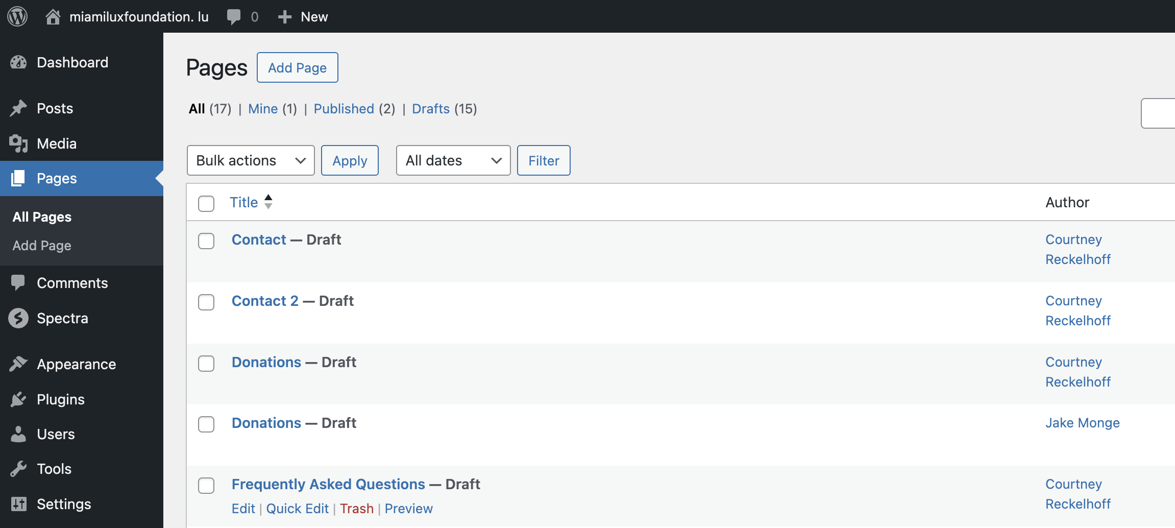
To bring the donation platform to life, our team built the site in WordPress, creating draft pages for key components such as Contact, Donations, and FAQs. This stage focused on translating our wireframes into functional page structures, organizing content, and ensuring the site aligned with GDPR requirements and the Foundation’s branding. Working collaboratively within WordPress allowed us to refine layout decisions, test navigation flow, and prepare the framework needed for a secure, user‑friendly donation experience that supports the Foundation’s long‑term digital presence.
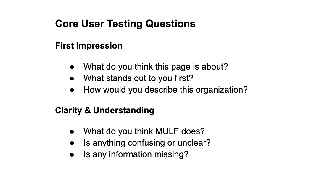
User Testing
To validate the clarity and effectiveness of the website, I conducted user testing focused on first impressions, navigation, and overall understanding of the Foundation’s mission. Participants were asked targeted questions about what stood out, what the organization does, and whether any information felt confusing or missing. Their feedback highlighted areas where messaging needed to be clearer and where layout adjustments could improve usability. These insights directly informed refinements to the high‑fidelity designs, ensuring the final site felt intuitive, trustworthy, and aligned with user expectations.